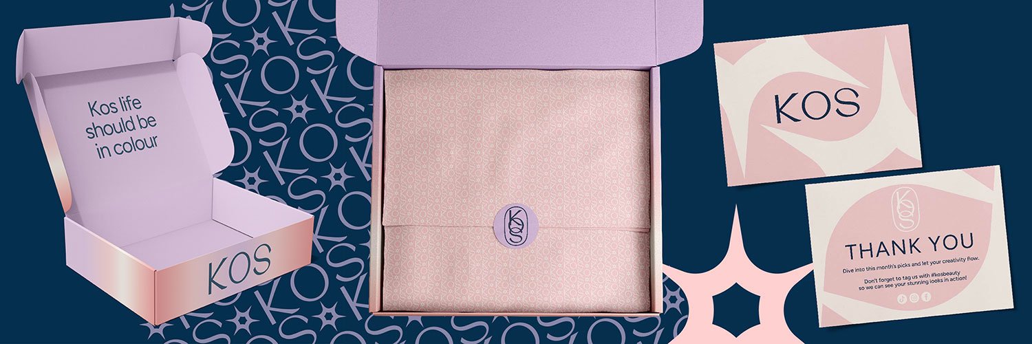
Kos — Designing a Makeup Subscription Brand Identity That Balances Softness and Boldness
Designing a makeup subscription brand identity design means every detail matters — from typography to colour choices. That was true for Kos, a fictional beauty subscription brand whose brief simply read:
“Kos require a logo and thank you card design, plus any extras!”
A few lines. A world of creative possibilities.
Drawing Kos Letter by Letter
For Kos, I felt drawn (pun intended) to create something entirely unique. No pre-existing fonts. No shortcuts. Just pure, hand-crafted typography. I wanted the makeup subscription brand identity design to feel both unique and versatile enough for packaging, digital use, and marketing.
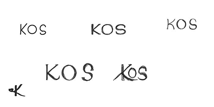
So I opened Procreate, grabbed my Apple Pencil, and started sketching an elegant serif wordmark from scratch. My goal was to create something refined yet modern — a letterform with soft curves and subtle contrast that would feel equally at home on a luxurious product box or a digital subscription page.
Once I found the shape and flow I loved, I rebuilt the logo in Illustrator, smoothing each curve and perfecting the spacing. The result was a crisp vector wordmark with a timeless, editorial feel — a mark that feels high-end without becoming overly traditional.
Colour Decisions in Makeup Subscription Brand Identity Design
A successful makeup subscription brand identity balances beauty with strategy — exactly what I explored with Kos. This project quickly became a study in how colour shapes brand personality — and why it’s so hard to choose without a real client’s direction.
I explored two entirely different palettes for Kos.
Palette One: A Gentle, Modern Vibe for a Beauty Box Brand
The first palette, the one I ultimately chose for this project, included:
- #ffcfcf — warm blush pink
- #e3c2e6 — delicate lavender
- #f38986 — lively coral pink
- #052f4e — deep, grounding navy
- #fff4eb — creamy, warm ivory
These colours felt soft and feminine, but with a vibrant, modern edge. They tell a story of beauty that’s joyful and approachable — a brand that wants customers to feel special, pampered, and seen.
It’s a palette that says:
✨ “I’m here for your everyday beauty moments — gentle, fun, and a little luxurious.”
The navy (#052f4e) was essential. It adds sophistication and contrast, preventing the palette from feeling too sugary or juvenile. The pinks and coral bring energy and warmth, while the ivory backdrop keeps the entire identity feeling clean and fresh.
Palette Two: A Bold, Luxury Look for a High-End Beauty Subscription
But I also explored a second path:
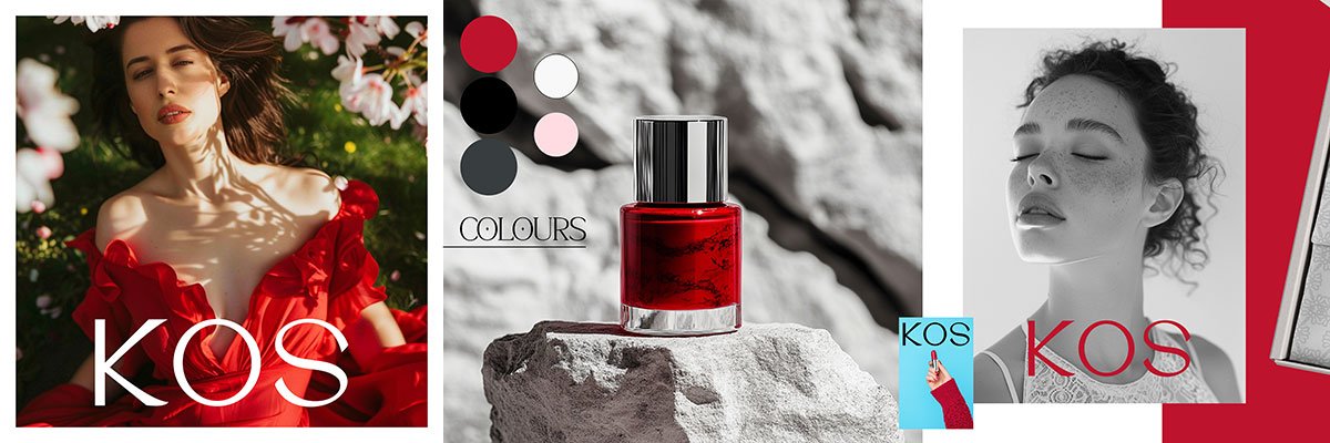
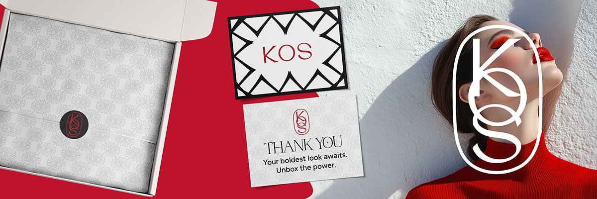
- #be132d — rich crimson red
- #383d3f — cool charcoal grey
- #f8f8f8 — clean soft white
- #000000 — deep black
- #ffdce0 — soft pink accent
This alternate palette felt bold, dramatic, and far more premium. It whispers luxury in a way that hints at higher price points and a more selective audience.
It’s a palette that says:
“I’m your statement beauty ritual — powerful, confident, and designed for those who want to stand out.”
These colours could easily elevate Kos into a more niche, luxury subscription offering — fewer customers, higher spend, and products that feel exclusive.
The Challenge of Fictional Branding
Creating a makeup subscription brand identity isn’t just about making things pretty — it’s about building emotional connection. Without a real client, I had to make some strategic assumptions about who Kos would be if they were real.
- Palette One would suit a more accessible price point and a wider audience who craves beauty as self-care — think gentle experiences, everyday confidence, and joy.
- Palette Two would serve a brand aiming for prestige, exclusivity, and a strong editorial presence — something you’d see in luxury beauty magazines or high-end subscription boxes.
In the end, I leaned toward the first palette because it felt optimistic and modern, perfectly suited to a fictional brand I imagined being playful, warm, and approachable. But the truth is:
Colour choice is never purely aesthetic. It’s entirely driven by who your brand wants to speak to — and how you want them to feel.
Deliverables for Kos’s Makeup Subscription Brand Identity
Once the direction was set, I brought Kos to life through a suite of brand assets designed to feel elegant, cohesive, and flexible:
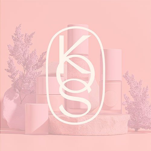
- Primary custom wordmark logo — fully hand-drawn serif lettering
- Stacked logo variation — ideal for square or compact applications
- Colour palette — soft but modern, balancing warmth with sophistication
- Packaging design:
- Subscription box exterior design
- Sticker seal for closures
- Patterned tissue paper for an elevated unboxing experience
- Thank you card design — maintaining typography and colour consistency across every touchpoint
Each piece was crafted to help Kos feel like a brand you’d be excited to welcome into your home — a brand that makes everyday beauty feel like a small luxury.
Why Does Visual Branding Matter for Beauty Subscription Boxes?
Even fictional brands deserve thoughtful strategy. Kos reminded me that brand design is never just about looking beautiful. It’s about making choices — colour, shape, typography — that speak directly to the hearts of the people you want to reach.
That’s true for a makeup subscription brand… and for every business wanting to connect deeply and authentically.

Thinking of your own beauty brand — or any brand — and feeling torn about colours, fonts, or style?
I’d love to help you clarify your direction. Drop me a message any time. Your brand deserves visuals as intentional and unique as the work you do.
The brief for this passion project was delivered by Brief Club over on Instagram.
Shop Brand Identity & Design Resources
Not ready to commit to a branding project yet? That’s cool – my shop has plenty of helpful resources to guide you in the meantime.