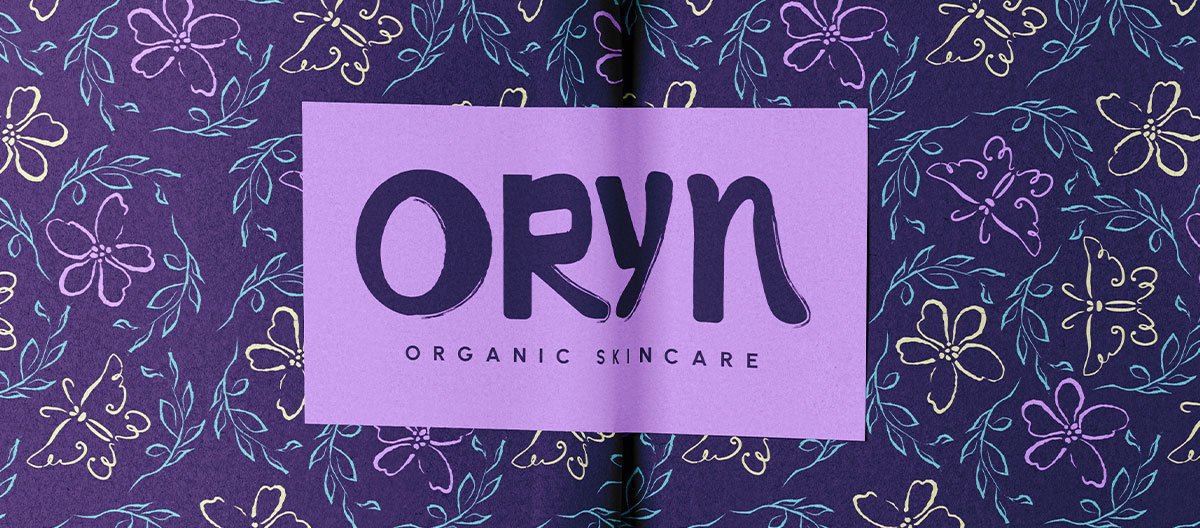
Oryn — Organic Skincare Brand Identity Design with Edge, Energy, and Intention
This organic skincare brand identity doesn’t whisper.
Oryn came to play — bold colors, hand-drawn textures, and a no-nonsense kind of confidence. The brief (from Briefclub on Instagram) asked for a logo and thank-you card for an organic skincare brand… but I knew this brand needed more than just pretty packaging.
It needed presence.
The Vision
Most organic skincare branding leans soft, safe, and neutral. But Oryn? It wanted to stand out on the shelf — and on your bathroom counter.
This identity was built around contrast:
- Sharp modern shapes with rough, organic edges
- Feminine colour with unexpected punch
- Calligraphic flair without feeling traditional
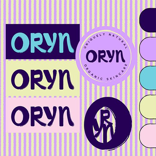
The name itself — “Oryn” — has a rhythmic, visual strength. So I let that lead the way with a custom, hand-drawn wordmark inspired by Asian calligraphy, but stripped back for clarity and style.
The Process
- Competitor and market analysis
- Moodboard creation rooted in energetic, feminine colour stories
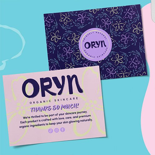
- Hand-drawn illustration work featuring roses, branches, and butterflies (but stylised, almost graffiti-like in texture)
- Exploration of shape and pattern to support packaging and brand assets
The final vibe? Organic meets editorial. Like if your skincare line had its own design column in a bold, modern beauty magazine.
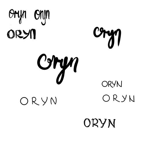
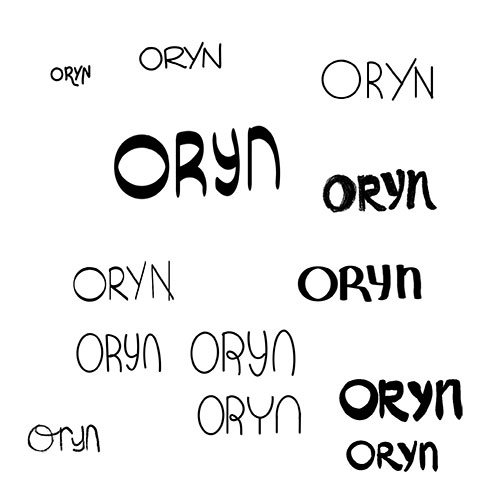
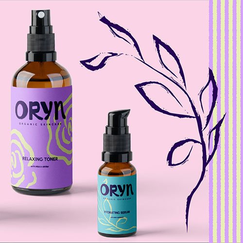
Deliverables Included:
- Hand-drawn wordmark logo
- Stylised brand mark
- Circular badge logo
- Custom illustrations (rough-edged, abstract roses, butterflies, branches)
- 2x pattern designs
- Thank you card design
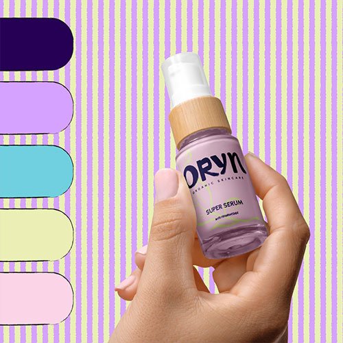
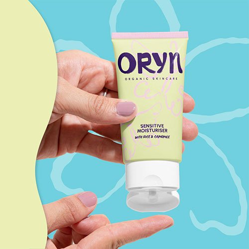
- Skincare product labels + packaging
- Full colour palette system
Everything was designed to be memorable, functional, and flexible across digital and physical touchpoints.
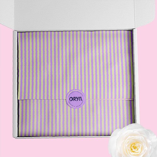
Organic Skincare Brand Identity Design for Founders Who Want to Make a Statement
Oryn might be a fictional brief — but the need behind it is very real.
If you’re building a skincare or wellness brand and you’re tired of seeing the same beige branding everywhere, you’re not alone. You don’t have to tone it down to be taken seriously. You can be organic and bold. Strategic and expressive.
Because design should reflect the actual energy of your business — not just what’s trending in your niche.
✨ Want a brand that doesn’t blend in?
Explore my Signature Identity System, or start with a Brand Clarity Intensive to figure out what makes your brand visually unforgettable.
And if you’re somewhere in between? Just message me. I’ll meet you where you are.