Ever wondered what actually happens during a rebrand? Here’s the full story of one.
Ever wondered what actually happens during a rebrand? Here’s the full story of one.
There’s a moment most small business owners recognise, even if they can’t quite name it. The logo you made when you started out was fine at the time. It did the job. But the business has grown, and somewhere along the way, the branding hasn’t kept up. It doesn’t quite fit any more. You’re a bit reluctant handing out a business card, or you’ve noticed the logo looks blurry when you try to make it bigger, or you’ve quietly avoided certain opportunities because the visual side of things just isn’t there yet.
So naturally, you start considering a rebrand. Why? Because a rebrand takes what’s already working and gives it the professional foundation it needs to grow.
That’s roughly where Lisa was when she got in touch about a rebrand for Boss Mums Lanarkshire Network.
Where it started
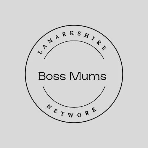
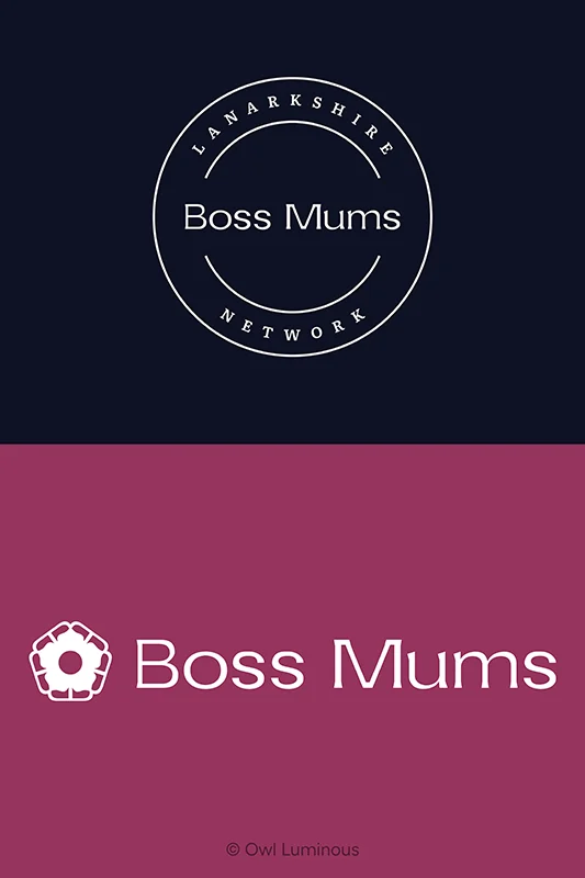
Lisa runs Boss Mums Lanarkshire Network, a business networking group for women in business across Lanarkshire. She’d built the brand herself using Canva, and the logo she’d created, a circular emblem with “Boss Mums” in the centre and “Lanarkshire Network” arching around the outside, was starting to gain real local recognition. People knew the name. They recognised the mark. That matters.
But the logo had practical problems that were getting harder to ignore. It didn’t scale well, so it looked fuzzy at smaller sizes and lost detail when enlarged. The original Canva file had been lost from her account, so there was no way to access or edit the source design. And there’s a detail most people don’t realise about Canva: their terms currently don’t allow you to take a Canva design and edit it outside of Canva. So even if I’d wanted to simply recreate the existing logo as a proper vector file in Illustrator, that wouldn’t legally have been an option.
Lisa’s original brief was fairly straightforward. She wanted the logo to look more professional, with a custom wordmark that could eventually be trademarked. What she ended up with was quite a bit more than that.
Building a wordmark that’s actually yours
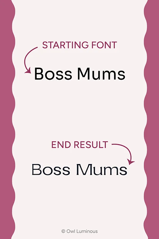
The first thing I tried to do was find the original font Lisa had used in her Canva emblem, so I could use it as a starting point for the custom wordmark. We couldn’t find it. Lisa couldn’t remember what it was, the file was gone, and none of the font-finder apps I ran it through could match it either.
This matters more than it might seem. When your logo is just your business name typed in a particular font, anyone can copy it. They find the same font, type your name, and suddenly your “logo” isn’t yours at all. There’s nothing to trademark, nothing to protect, and nothing that makes it distinctive. That’s the difference between a wordmark and a name in a nice font.
I needed a base font with a licence that specifically allowed editing of the individual letter shapes, which ruled out a lot of options. Font licensing is one of those invisible things that can cause real problems if you get it wrong, so I tend to work with Google Fonts where possible because the open licence gives me the freedom to modify glyphs without any legal risk.
I settled on Sora, which had a similar structure to the original on the lowercase “u” and “m”. There was enough natural difference to make the wordmark distinct from the outset. From there, I adjusted letter shapes, including reworking the “s” to sit closer to the feel of the original, while keeping everything different enough that the wordmark became genuinely unique. The result looks like it belongs to the same family as the original emblem, which preserves the brand recognition Lisa had already built. But it’s now something nobody can replicate just by finding the right font.
Fixing a colour that looked right but wasn’t
The deep pink that Lisa had been using as the main brand colour looked great. The problem was that it didn’t pass accessibility contrast checks when paired with white text. That means any white text placed on a pink background, on social media graphics, on printed materials, on a website, wouldn’t meet the minimum readability standards. It’s the kind of issue that’s easy to overlook because it looks fine to most people, but it affects anyone with reduced vision and it can also cause problems with web accessibility compliance.
I adjusted the colour just enough to pass contrast checks with both pure white and pure black text. The shift is so subtle that you’d only notice it if you put the original and the new colour side by side, but it means the brand now works everywhere without compromising readability. Small decisions like this are the kind of thing that separates a properly considered rebrand from a cosmetic refresh.
When a monogram wasn’t the answer
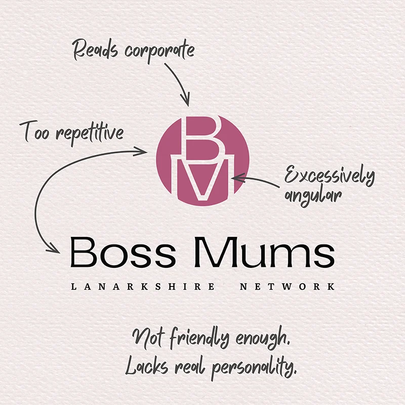
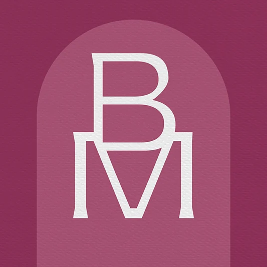
Once I’d built out the full logo in vector format, I started developing the broader suite. After building the wordmark, the next logical step was a monogram. The B and M from the custom wordmark gave me the raw material, and monograms are useful for small-scale applications where a full wordmark won’t fit. But when I stepped back and looked at it in context, the monogram on its own had a very specific energy.
The letterforms are angular, with sharp corners and a lot of straight edges. Placed alongside the wordmark in a lockup, the overall feel skewed corporate. A bit tech-company and actually quite masculine in structure. The balance wasn’t right for these two elements to work as intended together. It definitely wasn’t friendly enough.
Even the berry shade didn’t soften it the way you might expect. It’s a fairly gender-neutral colour in practice. Men use berry and mulberry tones, especially in clothing. So the colour alone wasn’t going to do the heavy lifting of making the brand feel like it belonged to a women’s network.
The monogram works well in isolation, as a standalone mark for very specific, small-scale uses. But it was never going to carry the brand visually on its own or sit happily in a lockup with the wordmark, because the combined effect was too sharp, too rigid, and too far from the warmth and community that Boss Mums actually represents. That’s why no lockup combining the monogram and wordmark exists in the brand files or the brand guide. It’s a deliberate omission, rather than an oversight.
I knew I needed to create something that would balance the sharpness of the type with something softer, an element that introduced curves and warmth and a bit of storytelling. An icon that was more feminine without being fragile. That’s what led me to the idea that became the most powerful visual in the entire Boss Mums identity.
Where the logo mark came from
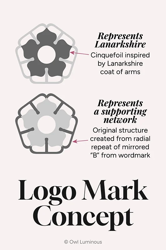
I like to connect the logo mark to the wordmark wherever I can, so there’s a visual thread running through the whole identity. In this case, the wordmark existed first, so I started with the custom “B” and experimented. When I placed a mirrored pair of Bs together and arranged them in a radial pattern, an interesting structure appeared. There was an outer chain of shapes, and in the centre, a space that almost looked like a flower if some of the forms were joined together.
I looked up the Lanarkshire coat of arms and found that it features two cinquefoils, a five-petalled flower. Five petals fit perfectly into the structure I’d already built from the Bs. So the central flower became a cinquefoil, rooted in the local heraldry, and the outer structure became a frame that represents the network itself, a supporting community around a central identity.
None of that meaning is obvious at first glance. It doesn’t need to be. But it gives Lisa something real to talk about when people ask about the logo, and it connects the brand to the place it serves in a way that’s genuinely considered rather than decorative.
The Psychology Behind a Logo Mark
People form an impression of a business within seconds of seeing its branding, often before they’ve read a single word. A logo mark like this does that work quietly – but powerfully.
The radial symmetry of the mark communicates equality and community in a way that’s worth mentioning. There’s no top or bottom, no hierarchy in the structure. Everyone’s around the same centre. For a network built on mutual support, that’s doing something subconsciously that a stacked or linear logo never could.
The flower itself carries associations of growth, nurturing, something being cultivated over time. That maps really naturally onto a network of women building businesses.
The curves register as warmth and approachability, while the open circle at the centre reads as welcoming, an open door rather than a closed shape. It suggests there’s room for more people, which is exactly what a network wants to communicate.
The structured outer frame, built from those repeated Bs, acts almost like a protective boundary. Support and shelter around something growing in the middle. Community holding space for the individual. It also reads as professional and purposeful.
The overall shape feels considered, not thrown together.
None of that requires explanation or a backstory to land. Someone seeing the Boss Mums logo mark for the first time is already forming a sense of what this network is about, simply from the shape of it. That’s what a well-designed logo mark actually does. It communicates before anyone’s had a chance to think about it.
“I’m not sure I need the flower”
This is one of my favourite parts of this project, and I think it’s worth sharing honestly because it says something important about the rebrand process.
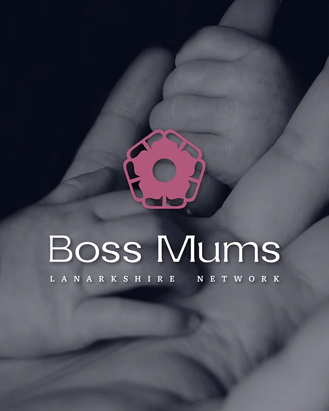
When Lisa first saw the stacked logo with the logo mark included, her reaction was “I’m not sure I need the flower.” That’s a completely understandable response. She’d asked for a professional version of her existing logo, and now there was this new element she hadn’t expected.
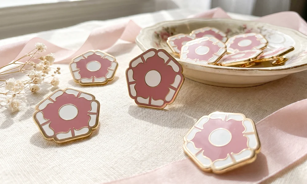
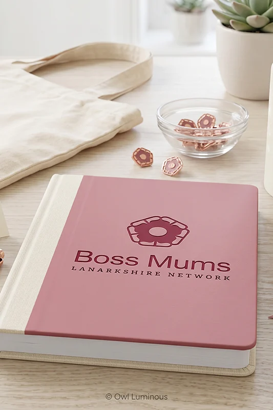
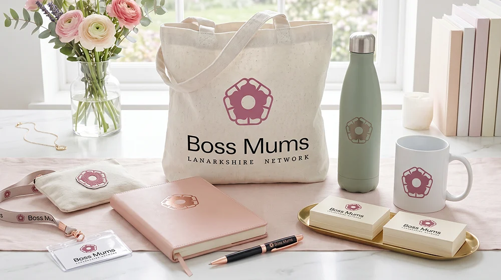
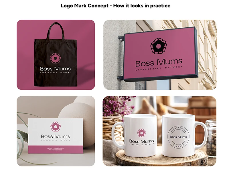
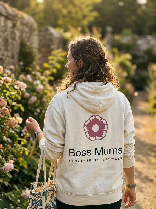
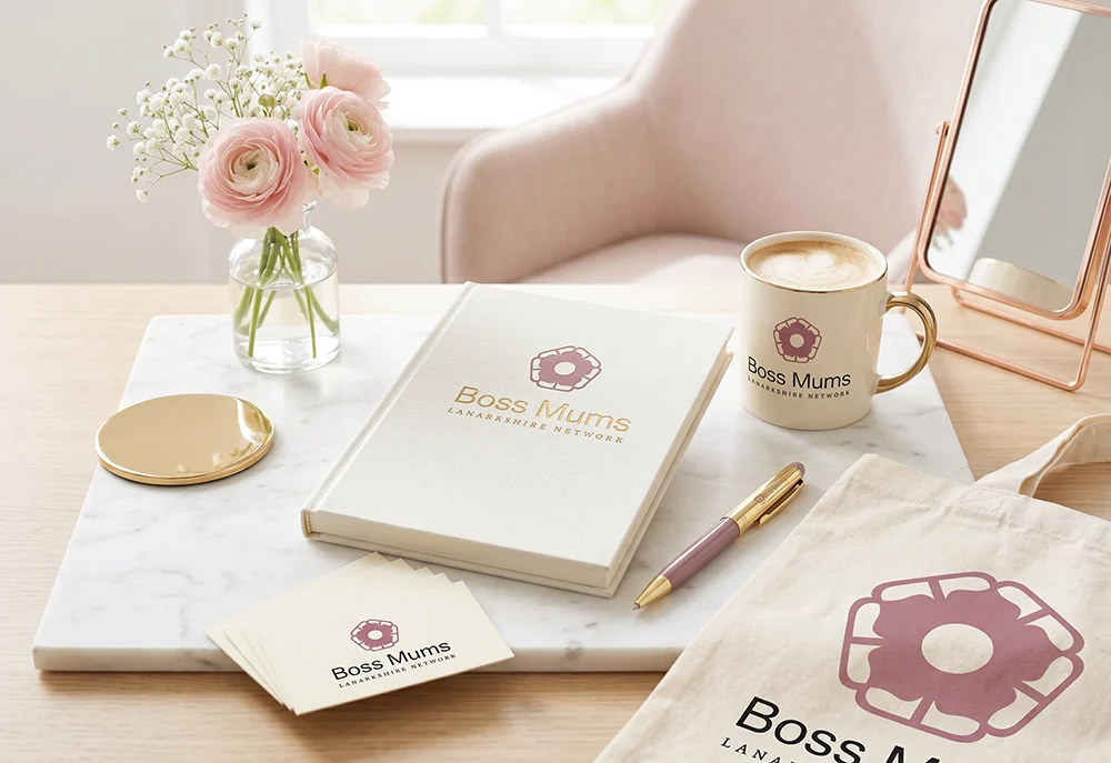
But as the presentation unfolded and the story behind the design choices became clear, her feeling shifted completely. By the time she saw the lifestyle mockups of branded stationery, tote bags, mugs, business cards, signage and merchandise, she was genuinely excited about the possibilities. That’s one of the reasons I present brand projects to my clients rather than just handing over a link and letting them figure it out. Sometimes the potential of a design isn’t immediately obvious, especially when it’s something you haven’t expected. A client isn’t always going to see what a brand designer sees straight away, because we’re already thinking about how the identity works across print, product, and digital. A good presentation bridges that gap.
Lisa requested zero revisions and approved the identity as presented.
What a rebrand actually delivers
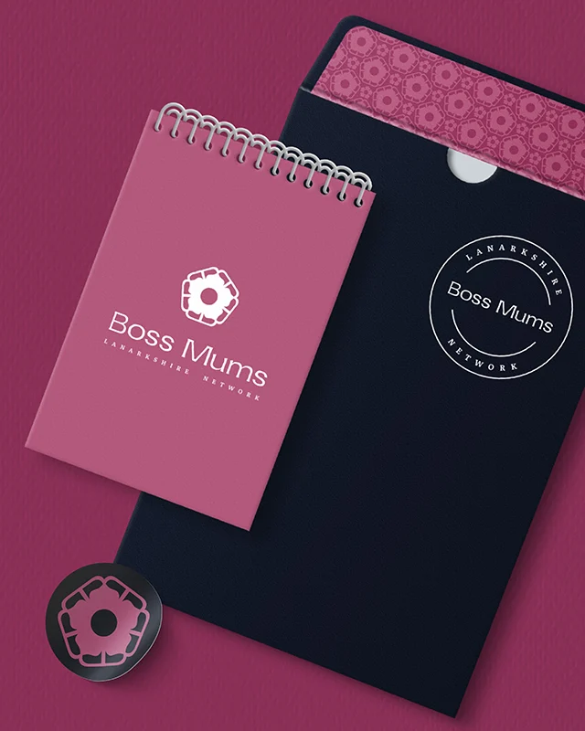
The finished Boss Mums identity isn’t just a logo. It’s a system. The logo suite includes the emblem, the wordmark, the monogram, the logo mark with and without the wordmark, a stacked version, a longline version, and the cinquefoil icon on its own for use as a decorative element or favicon. Each version exists for a reason and covers a specific use case, from tiny social media profile pictures through to large-format signage.
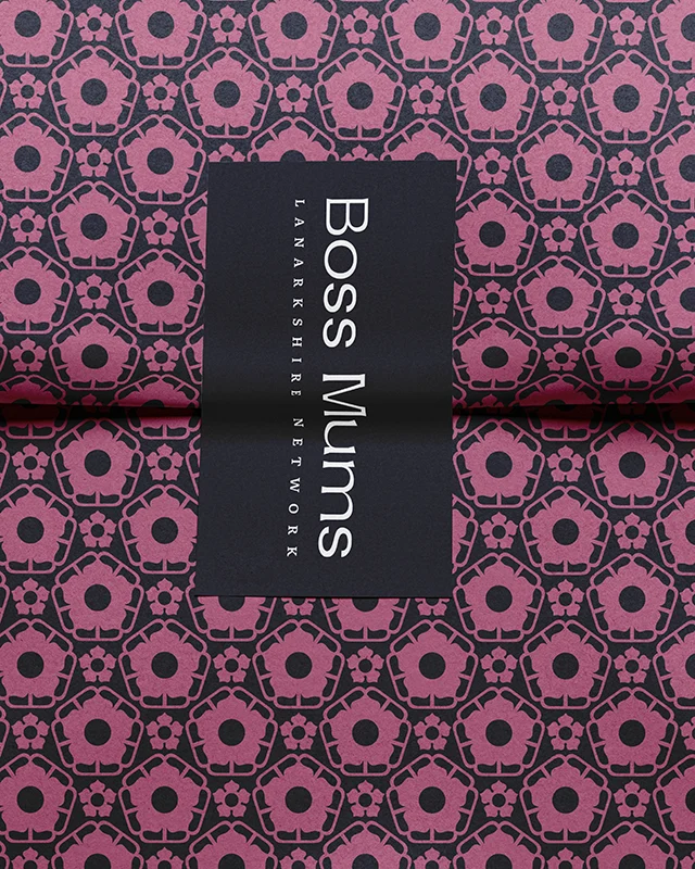
I also created four brand patterns using the logo mark and icon in different colour combinations from the palette. These give Lisa something to use across backgrounds, printed materials and digital content without needing to design something new every time.
Beyond the visual assets, the project included a comprehensive brand guide covering logo usage, colour specifications, typography, and spacing rules. There’s also an at-a-glance brand guide for quick reference, and my standard instructional document explaining file types and when to use them, plus a breakdown of CMYK versus RGB colour modes. I organised all of this into a folder structure that makes it straightforward to find the right file when you need it, whether you’re sending something to a printer, uploading to social media, or briefing a freelancer.
I also ran copyright and uniqueness checks on the logo mark to make sure it wasn’t unintentionally similar to any existing registered marks. That’s a step a lot of people don’t think about, but it protects the business down the line.
I delivered everything through my client portal, ready for Lisa to download and start using immediately.
How do you know when you need to rebrand?
If Lisa’s story sounds a bit familiar, you’re probably in a similar place. Your branding was good enough when you started, but your business has moved on and the visual side hasn’t kept pace. Maybe you’ve lost the original files. Maybe the logo doesn’t work well at different sizes. Maybe you’ve been meaning to sort it out for a while but it never feels like the right time.
A rebrand doesn’t have to mean starting from scratch. Sometimes, like with Boss Mums, it’s about taking what already works, the name, the recognition, the personality, and giving it the professional foundation it needs to grow properly. The right designer will keep what matters and build around it.
Thinking it might be your turn for a rebrand?
If you’re wondering whether your business is ready for a rebrand, I’d love to chat about it. No pressure, no hard sell. Just an honest conversation about where your branding is now and what might help it work harder for you.

Lesley Miles
Strategic Brand Designer & Digital ConsultantEmpowering businesses to soar with captivating brand experiences.
A special thank you to Lisa for allowing me to share this story and the behind the scenes.