
This Well Nested brand design case study walks through my process from mind-map to mockups — designing a layered lamp-bird-well logo, a bold retro colour palette, and social templates a homeware brand can use every day. I’m a Lanark-based designer working with women-led UK businesses who want clarity, personality and ease.
Well Nested brand design: The brief
Well Nested are a home furniture brand who needed a fresh identity: a logo, social templates, and a visual system that feels homely and playful with a stylish retro twist. I created this as a Brief Club passion project to stretch my skills and show how I approach brand work from first spark to roll-out.
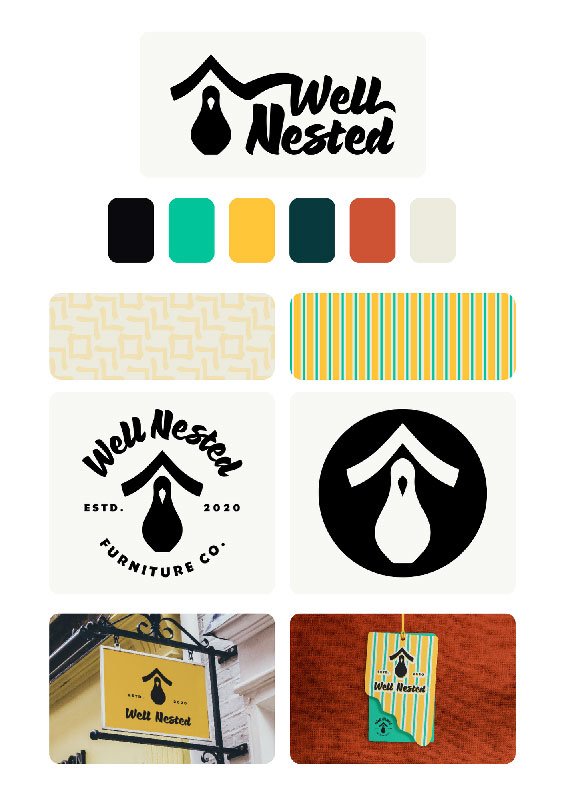
My Process at a glance
Mind-map → Mood board → Visual research → Logo construction → Wordmark exploration → Colour system → Mockups & audit → Social templates → Presentation
I run passion projects exactly like client work. We set the feeling first, then I build a simple shape with layered meaning, stress-test it at tiny and large sizes, and package everything with clear rules and editable templates. I pause at natural checkpoints for feedback so there are no surprises, just steady progress. Want the step-by-step with the why behind each stage? Read about my brand design process.
Finding the story → Mind-mapping the Well Nested brand Identity
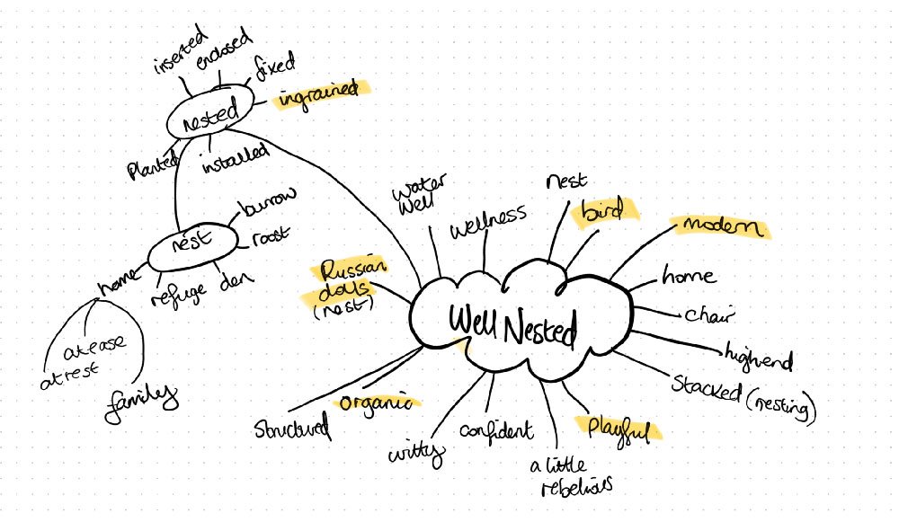
I started with a hand-drawn mind-map to unpack the everything encompassed within the brand Well Nested. I explored ideas like rest, refuge, bird, nest, family, well/wellness, Russian (nesting) dolls, organic vs structured, playful, a little rebellious. That exercise gave me my narrative anchors: light, home, and layered meaning.
Setting the vibe → Mood board & visual direction
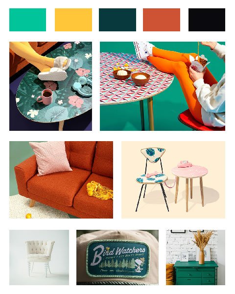
Next I built a mood board: mid-century textures, playful patterns, cosy interiors, and a few “found” objects that feel lived-in. I also curated two stock collections on Unsplash – one for brand vibe and another for logo research (wells, nesting dolls, birds, rooflines). This kept the direction grounded while I explored shapes.
On client projects, I also:
- share the board for quick yes/no feedback and comments (so we align on feeling before design),
- extract HEX values and run early contrast checks for accessibility,
- note image usage/licensing and flag any assets to replace later,
- define simple Do / Don’t rules for photography, textures and patterns,
- capture a mini creative brief (“This brand should feel… Must avoid… Must include…”) to guide the next stage.
Well Nested Brand Design: Creating an Icon That Works Everywhere
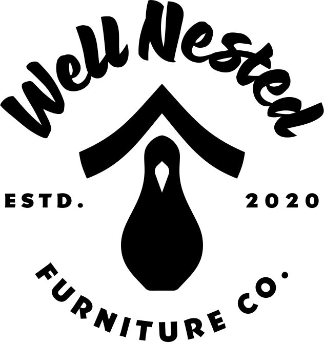
At first glance the mark is a lamp. Look closer and you’ll find:
- a nested-doll style bird hidden in the lamp body (a nod to “nested”),
- a shade that reads like the roof of a quaint well (a nod to “well”).
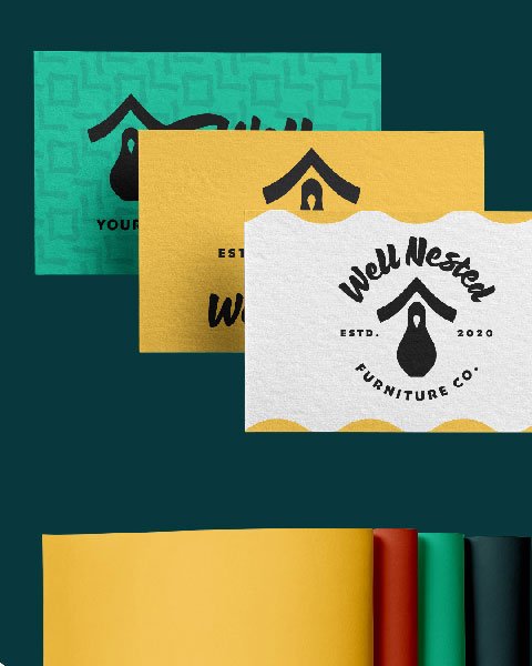
All those parts resolve into a clean, memorable icon that “clicks” straight away. The shapes sit neatly with plenty of breathing room, so your eye naturally completes the form; that’s why it stays crisp at 16px on a favicon and just as strong on a shopfront sign. Because it’s built from solid geometry rather than fussy detail, it works in one colour, foil, emboss or stitch, which keeps production easy and consistent.
It signals the homeware category instantly (lamp = home) while the bird/well twist makes it unmistakably “Well Nested”. Paired with the slightly retro script wordmark, it lands as modern-meets-nostalgic — playful but grown-up. And it gives us a ready-made design language for everything else: angles for frames, soft curves for patterns, and little “perch” moments for icons, so every touchpoint feels connected without extra effort.

Typography & Tone → Playful with a retro twist
I trialled a handful of wordmark styles before landing on a stylised script with a light retro feel. It echoes hand-painted shopfronts and mid-century signage – warm, human, and a touch nostalgic – which pairs beautifully with the geometric simplicity of the icon.
Well Nested Brand – Colour Palette Design → Bold, retro, and memorable
This palette isn’t calm and earthy – it’s confident and retro-inspired: vibrant teal (#00C49A), golden yellow (#FFC53A), deep teal (#07393C), rusty orange (#CD5334), grounded by near-black (#0A090C). Together they create a homely yet stylish energy that stands out on shelves and social.
From shapes to system → How I built it
- Shape study: I sketched lamp forms, bird silhouettes, and rooflines to see how they could nest together without losing clarity at small sizes.
- Versatility test: I checked the mark in 1-colour, reversed, tiny favicon scale, and large signage to ensure it holds up everywhere.
- Type pairing: I balanced the playful script with clean supporting type for body text and UI so the system feels usable, not just pretty.
Real-world check → Mockups & audit
Before I call a direction “done”, I run it through mockups: swing tags, packaging stickers, social posts, signage. This lets me audit spacing, contrast, and legibility in context and make small tweaks that save headaches later.
Social media templates → Designed for real use
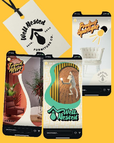
I built a set of professional templates in Illustrator (headline, product spotlight, colour inspiration, sale, UGC). For a live client I’d migrate these into Canva so the team can edit quickly without breaking the brand. Templates like these are where brands win back hours each month.
Feedback loop → How I quality-check
Even in a self-initiated brief I work as I would with a client: pause points to review, accessibility and legibility checks, and outside opinions to catch blind spots. As this Well Nested brand design case study demonstrates, that process protects clarity and keeps the story intact.
The final showcase
To present the identity I created an Instagram carousel with brand imagery and mockups – the same way I’d support a client launch. For real premium client projects I also prepare a second carousel for the client to announce their new brand and keep everything on-brand from day one, making life easy.
Lessons for business owners → Why layered design matters
As with this Well Nested brand design case study, when strategy and story sit inside your visuals, you get:
- Recognition – people remember what your logo means, not just how it looks.
- Ease – a system of colours, type, and templates you can actually use.
- Confidence – consistency that feels professional across every touchpoint.
Brand design based in Lanark, working across the UK
If you’re a purpose-led business and you want a brand that feels like you – with clarity, warmth, and a sprinkle of retro charm – I’d love to help.
Next step: Book a Power Hour or explore my brand design services.

Thanks for reading
If your brand or website no longer feels like it reflects your business properly, I offer brand identity and web design support to help bring things back into alignment.
You can book a free 30-minute consultation to see if working together would be a good fit.
Shop Brand Identity & Design Resources
Not ready to commit to a branding project yet? That’s cool – my shop has plenty of helpful resources to guide you in the meantime.