Most people are surprised when they discover that in my brand identity design process, I only ever present one logo concept.
Not three. Not five. Just one.
It’s a deliberate choice that helps my clients make faster, more confident decisions, and it’s one of the main reasons my process feels calm and structured rather than overwhelming. In this post, I want to share why showing fewer options actually gives my clients more clarity, not less, and how psychology, strategy, and trust all play a part.
The tradition of “three options”
When I first started designing, I used to present three logo options because that’s what every designer I knew did. But over time, I noticed that this was actually working against me and my clients, while the process was also becoming unnecessarily complicated.
In the design world, it’s common practice to show clients three logo options. It seems logical: more choice should mean more freedom. And that’s what I originally thought.
Well… The reality is that too much choice often leads to confusion. When you see multiple designs at once, your brain immediately starts comparing them, focusing on colours, fonts, and small details instead of the bigger story.
This is what psychologists call decision fatigue — when our brains tire from making too many similar decisions. In branding, that kind of fatigue blurs the clarity we’ve worked to build.
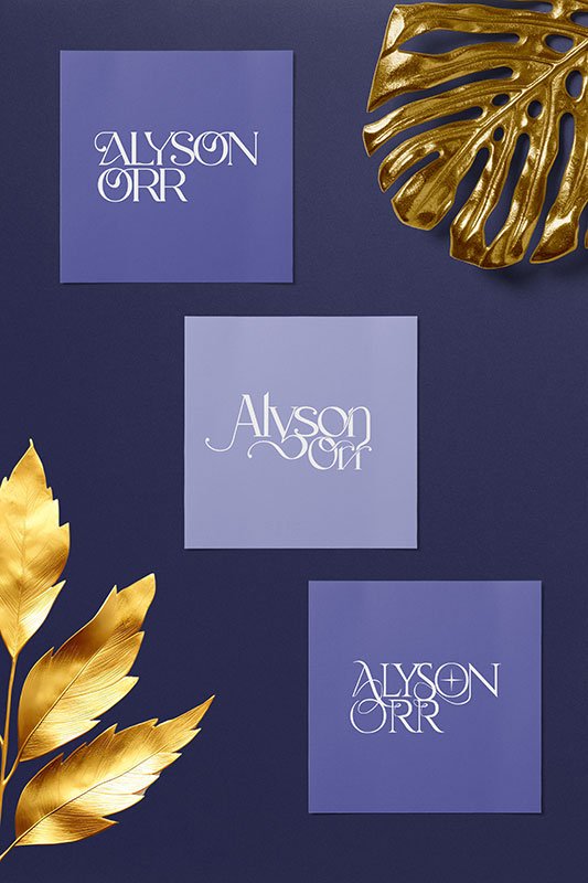
There were so many projects where clients struggled to decide between options. One was eye-opening. They asked if I could take the lettering from one concept and pair it with the symbol from another. The problem was that the typography had been custom-built, so it didn’t quite fit. The design lost its harmony, and that moment taught me how important it is to protect the integrity of a single, well-formed idea.
The problem with too much choice
Here’s what usually happens when three concepts are presented:
- The client likes one element from each design.
- The designer is asked to merge them into one, creating a Frankenlogo that feels disjointed.
- The brand loses its coherence and emotional impact.
When everything is a little bit of everything, nothing stands out. Our brains naturally prefer clarity and simplicity because they are easier to process — something psychologists call cognitive ease.
Instead of giving my clients more to juggle, I focus on giving them one strong direction that already fits their strategy, audience, and personality.
Why the one logo concept approach works
My one logo concept method is rooted in clarity, strategy, and neuroscience.
Here’s why it works so well:
1. Deeper thinking upfront
Because I only present one concept, I spend more time refining the strategy before design begins. What you see has already been tested against your goals, values, and audience insights.
2. Clearer storytelling
A brand identity should tell one story, not three competing ones. Focusing on one concept keeps the story consistent and emotionally resonant.
3. Faster alignment
Without competing visuals, you can focus on meaning rather than getting distracted by details. It helps clients connect emotionally to their brand faster.
4. Confidence through clarity
When everything points in the same direction, clients feel sure about their decision. They don’t wonder which version is “best” — they just know which one feels right.
5. Collaboration, not confusion
Clients are still involved, but in a focused way. Feedback becomes about refinement rather than indecision, which keeps the process calm and enjoyable.
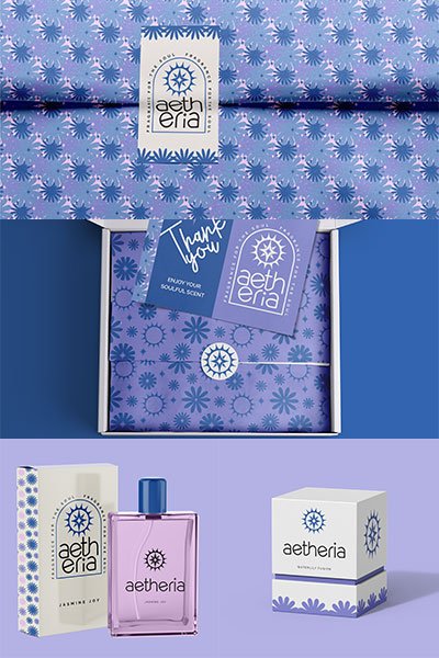
When I first used the single concept approach, the client’s feedback was simple: “It’s perfect! Exactly what I needed and more than I ever imagined.” We’d stayed in sync through every stage, so the final reveal felt natural. They signed off with no revisions, and that moment confirmed for me that one clear direction creates more confidence than endless options ever could.
What happens instead
When you work with me, you’re not getting one idea pulled from thin air. You’re getting one refined, strategically-led concept that reflects all the research, mapping, and creative thinking that came before it.
Here’s how that looks in practice:
- We start with discovery and a collaborative questionnaire to capture your vision.
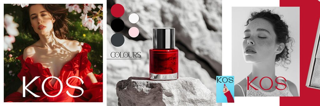
- I create a detailed brand direction presentation that includes mood boards, colour palettes, and type directions for approval.
- I design one strong, meaningful concept based on that agreed direction.
- You see it come to life through a brand presentation filled with visuals and mockups that show how it works in the real world.
You’re still involved at every step, but the focus stays on building something cohesive and confident rather than weighing up multiple directions.
Why one logo concept doesn’t mean one idea
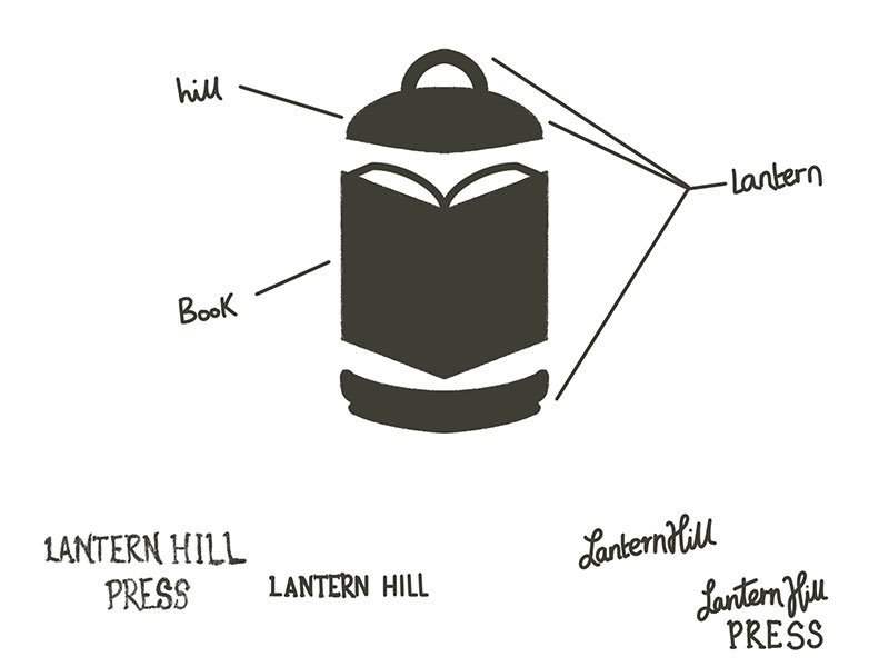
Behind every one-concept presentation are dozens of sketches, explorations, and experiments. I test multiple directions, refine them, and bring forward the one that best expresses your strategy and story.
So while you only see one logo, it’s the result of exploring many ideas, distilled down to the most purposeful solution.
Sometimes that “effortless” moment comes after pages of messy sketches, exploring every angle until one shape finally clicks. Other times, I can see the idea right away because it’s so clearly the right fit for the business and I can picture how it will live on your website or packaging.
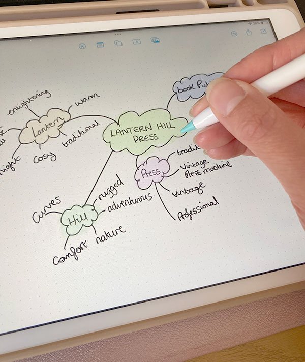
Inspiration comes from everywhere: a detail in a stock photo, a note in my mind-map, a colour or a phrase that lingers.
And sometimes it’s the typography itself that needs to carry the story, so I’ll sketch a wordmark over and over — often fifty times on my iPad in Procreate — until the rhythm of the letters feels exactly like the brand’s voice. It’s a mix of intuition and intention, balancing logic with that little spark of magic that makes a design truly theirs.
One logo concept: The takeaway
Your brand doesn’t need three directions to be strong. It needs one direction that’s right.
That’s what the one logo concept approach is about: clarity over clutter, focus over fatigue, and a calm, collaborative experience that helps you feel proud and sure of your brand.
What would your brand feel like if every detail was designed with this same clarity?
If you’d like to see how this fits into my wider approach, you can read My Brand Identity Design Process Explained. Or, if you’re ready to explore your own brand direction, you can book a Power Hour — a focused session to bring clarity and momentum to your next steps.

Thanks for reading
If your brand or website no longer feels like it reflects your business properly, I offer brand identity and web design support to help bring things back into alignment.
You can book a free 30-minute consultation to see if working together would be a good fit.
Shop Brand Identity & Design Resources
Not ready to commit to a branding project yet? That’s cool – my shop has plenty of helpful resources to guide you in the meantime.